Friday, 26 February 2016

Developing a Group Game.


We were separated into groups where we were told to design a game with has to be a 2D platform game but cant be side scrolling, which limited us on the game type and play through. The group I'm in contains 4 people James, Emma, Ben and myself which in all which I'm happy with due to having small communications which will lead to less confusion and more productivity.
We named ourselves 'Pink Flamingo' in which we came up with the firm idea of having a mix between 2D and 3D where back drops and characters will be in 2D while the platforms will be in 3D to where this will bring out more of the game to the player.
From this blog Ill be posting on what I have done in the way of game production from visuals to modeling etc.

We were all tasked on developing back grounds for our game as a result of different levels or situations that our game characters could be in so we spilt up to developing one underwater level, mountainous level, Cave level and finally grounded level. I developed the ground level where I added mountains so we could have a continuous story playing in the back drop as the player went through the game.
The Art style we chose to develop in our game is Cell Shading due to everyone being able to develop this type of style in to the game.


 This was the final idea I came up with where I would have the clouds move while in game mode. Developing this was really fun because it was the first time I used cell shading where to me I thought I did a good job on it. To help me develop and accurately position the background I was given a basic game level silhouette where placing that on the image helped me determine what places where going to be visible to the player as a I had a path following up to the mountains leading to the process of the storyline.

The Original Game Design.


I developed  block designs for the platform which had been inspired by earth of the cell shading which was all dropped due to everyone agreeing on the level being underwater.

 Under-Water Design.

When developing the layout of the underwater level I was told to quick plan out the layout for my friends to develop the layout quickly so we could all see what it would look like.


This is a small chunk of the original design in which allowed my friend to develop the layout which gave her the basic understand on what we wanted for the game.


From there I started on the texturing process in which we all agrees on where I would using Turtle to develop nice cast shadows on the rocks that I would texture.

I quickly modeled a rock and textured it to give everyone a better understanding on what the process would end up being like.

Here's some examples of that.


 What we all agreed on is that the rocks would be blue due to them being at the bottom of an ocean and that would be slightly detailed to bring them out a bit more to the player.
I added barnacles and seaweed on to see if they wanted to go with 3D on that or go 2D.
As a result I'm going to have to place these all over the platforms at the end when everyone is happy with the main texturing.
I'm going to have to model out different shapes and sizes of coral and seaweed to not unbalance the layout.

As well rocks I textured some spikes as well a ships wheel that were placed there by my friend to develop where I really like the out come of the design. I might have to rig the planet life to sway about in the game to bring it out more to the player but it depends on what my team wants as it could be a distraction from the enemies the player has to dodge.


This is a close up on the layout of the game and how the player will have to go through to collect the coins that we've placed. we may need to space out some stuff but the way it looks now I'm really happy with it so far need to add the sea bed and place it into Unity.


Next for me was the complete the shark sprits left off from James where all I had to do was clean them up and paint over them similar color and painting style as he did the first one. This was because the main artist James had gone Australia which was problematic when communication was in hand.


Developing these further was a fun and easy task to complete due to the art style needed to develop the character of the shark, in which the only troublesome part was tiding up the loose lines and complete some of the designs together.
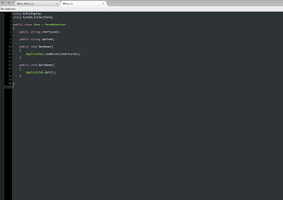
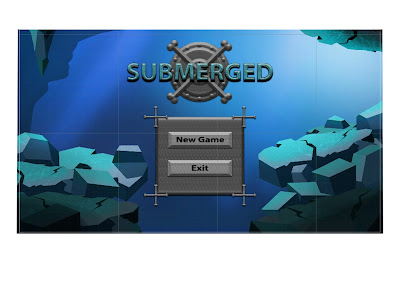
Afterwards I developed the coding for the main menu through tutorials online as well using some stuff I learnt in the lesson which allows use to click on the start and exist. when I decided to do this I knew coding wasn't my strongest suit but I tried my best and the end result I was very pleased and surprised with the working result. Ben was given the task of creating the menu layout and design where we both link together.


Final Thoughts:

 Overall the working in a group has been a really fun experience when working on a game because now I know the amount of time people can take to develop there work so next time I'll know a better way of time management for everyone to develop deadlines and sort out what's what. Even though most of my visual design work had not been used I had a good time texturing the game along with the gathering ideas of the group and coming up with the final end piece which I'm pleased with in the end, what we could have improved on was the scale of the game where we could have developed more levels which could have created a better story but apart form that I think we did well as a group for the first time.




Monday, 22 February 2016

Colour Theory


Understanding what colour can do to your art work is hugely important to know because it can guide viewers to what's important in your images such as backgrounds as a way of highlighting characters or certain objects. Colour could also be used to change what the viewer feels initially from the uses of bright colours or dark tones interacting as good or bad emotions.
When used incorrectly colours can make the audience feel lost or uncomfortable viewing if used extreme high bright colour by doing this the audience wont know what to look at.
Saturation:
Is the intensity of a colour.
Value:
Is the Brightest or Darkest of a colour.

For class work we were tasked to paint over two images of the cartoon character Yoda using colour theory one using bright colour and another to be the opposite of colour.


Sunday, 14 February 2016

Human hand modeling.


Human Hand Modelling.

When starting to model the hand  I started off with the simple shape and added edge loops to develop the palm, a cylinder for the middle finger where edge loops bent and the finger in to shape the producing a sphere  for tip of the finger to add finger nails. I then copied the middle finger and changed the shape to where the others would be placed as well the thumb, the final product looked like this:


Thursday, 4 February 2016

Statue For My Battle Arena


Mood Board.


Model Idea.
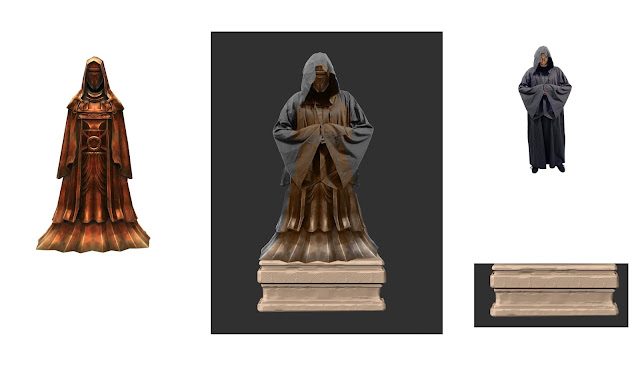
 My model idea came from the Star Wars statues players can see in the Old Republic and Jedi knight series, I chose to develop my idea from this because the designs of the statues can be seen as bring out the superiority of the environment and importance of its location.


I added a small piece of concept art as an example of how I think the final idea will go down.


Statue model sheet.
What I want from design is a robed figure placed around the center area of y battle arena to produce more a sacrificial theme to everything. For development I will have to develop the human inside before hand so developing the cloak, sleeves and hood proportionally be easier.


I developed the body of my statue, in which I didn't create the legs because it wouldn't be seen on the design due to the long cloak dropping down over them.I used the head and hands of the previous homework's in my design as a way to cut down on time within the 3D modeling of the character.


The hood first thing I started to work on as for me its easier for me to understand the proportions of the body in which I made first allowing me to fit easily later when I complete the full robes of my statue. Then came the sleeves where I modeled the one and mirrored over to get the same model.


When designing the robes i tried to create it from the model design that i made but it didn't seem to work out the way I wanted the design to go so i had to rethink my process in which  decided to recreate the design.


What I had chosen to do was split the design into two section with a lower part and upper which i found to be easier to form and look more natural around the body.


From my original idea I had the robe being more droopy with the cloth, in which I decided on having the characters cloths more fitted.


The Final Model design.
After some complications with the cloak I'm really pleased with the final design even though it has some differences to the original, the statue looks like to me looks really good all it needs is to texture it.


When it was time to UV-Map I started with the clothes then moves to the body as it was much easier than combining everything together, but when I had to unwrap the body it took me a long time to figure out what parts to do first due to the smaller pieces having a bigger impact when stitching together as it went wrong many times.


Once the UV-shots were done I then made my own rock texture but mixing up different textures together my aim was to develop a texture similar to the ones on my battle arena but can stand out more when viewing the environment. I wasn't sure if I should go for a smooth stone texture or more jagged one but I decided fitting the theme of my arena i would got for a curved surface look where I knew the statues place would be.


The next stage was to use an Ambient Conclusion this will produce a nice shadow effect towards the texture to bring the statue out more, in which I did this to all the parts to the model as I wanted it to look its best.


I then placed the UV-Maps into photo as well the Ambient Conclusion and the rock texture then placed everything together, I painted on a brief grey scale paint over the mapping and formed a rocky texture this allowed a small amount of dark textures over the stone to bring out some ash of the volcanic environment.
Here's a what the texturing process in Photoshop for the body.


I then started to rig the statue this allows you to move the statues arms, and whole body into positions of a statue would be, for my case it was only the arms which was easy apart from placing the fingers together which turned out to be hardened than I thought.


When rigging I had to think how would the bones move if in this stance and what positions they would be in. So when rigging I had to move each joint slowly to understand the limits of how far the skeleton would go because if move too far the sleeve in my case would rip so moving individual joints was a slow process but effective non the less.

This is the final design came out like keeping the idea of have the hands locked together. The next stage was to upload the textures and place them on the model.


When texturing you  need to create a new lambert this would allow the texture to sit on top the empty one. Here's an example of the layout.


Here is what the final textured design looks like.
I then exported the statue in my Battle Arena where in the end I'm really pleased of the end result I think it looks fantastic and brings out more mystery to the environment.


My Final thoughts over this project has been really enjoyable from the freedom to design everything to the how the design has to link towards the battle arena made the decision on what to do a bit challenging because  at first I didn't really know what to do at the start. What I think I could have improved on with my statue is through the design of having much more detailed textures on and could have put it through zbrush to create some cracking in the broken statues.


Wednesday, 3 February 2016

Life Drawing Part 2


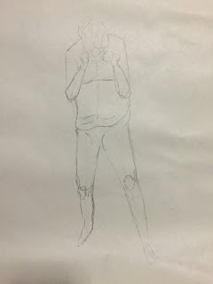
This is the second terms set of life drawings in which to me I've improved from the first term, which I'm very grateful to be able to continue on developing my skills to become a better drawer. I have picked some of the images I feel went well in this last year of life drawing.
Through life drawing I found out that using my left hand became a huge advantage when drawing because it loosened up my style and it turned out in some areas I was better then my usual hand.


Every session of life drawing we start off with some 1 minutes poses as a warm up throughout the two terms I have noticed my improvements in which I'm happy about but I would have liked to develop more as an artist to become better at drawing human figures.


 During the lessons we have experimented in all different ways with the uses of colour where we were to show the uses of light and dark with either cold colours or mixed blending with warm and cold. As well the use of the wrong hand where I found that using my left hand I could develop a figure decently and after a while going back to my right hand I improved with my viewing.


Overall I think I've really improved over the two terms which I'm hoping for continue to develop life drawing in the coming years as I want to become much better as I am now. As an improvement I would like to develop my weaknesses more which I would like to focus on the face in detail.