Mood Board.
Model Idea.
My model idea came from the Star Wars statues players can see in the Old Republic and Jedi knight series, I chose to develop my idea from this because the designs of the statues can be seen as bring out the superiority of the environment and importance of its location.
I added a small piece of concept art as an example of how I think the final idea will go down.
Statue model sheet.
What I want from design is a robed figure placed around the center area of y battle arena to produce more a sacrificial theme to everything. For development I will have to develop the human inside before hand so developing the cloak, sleeves and hood proportionally be easier.


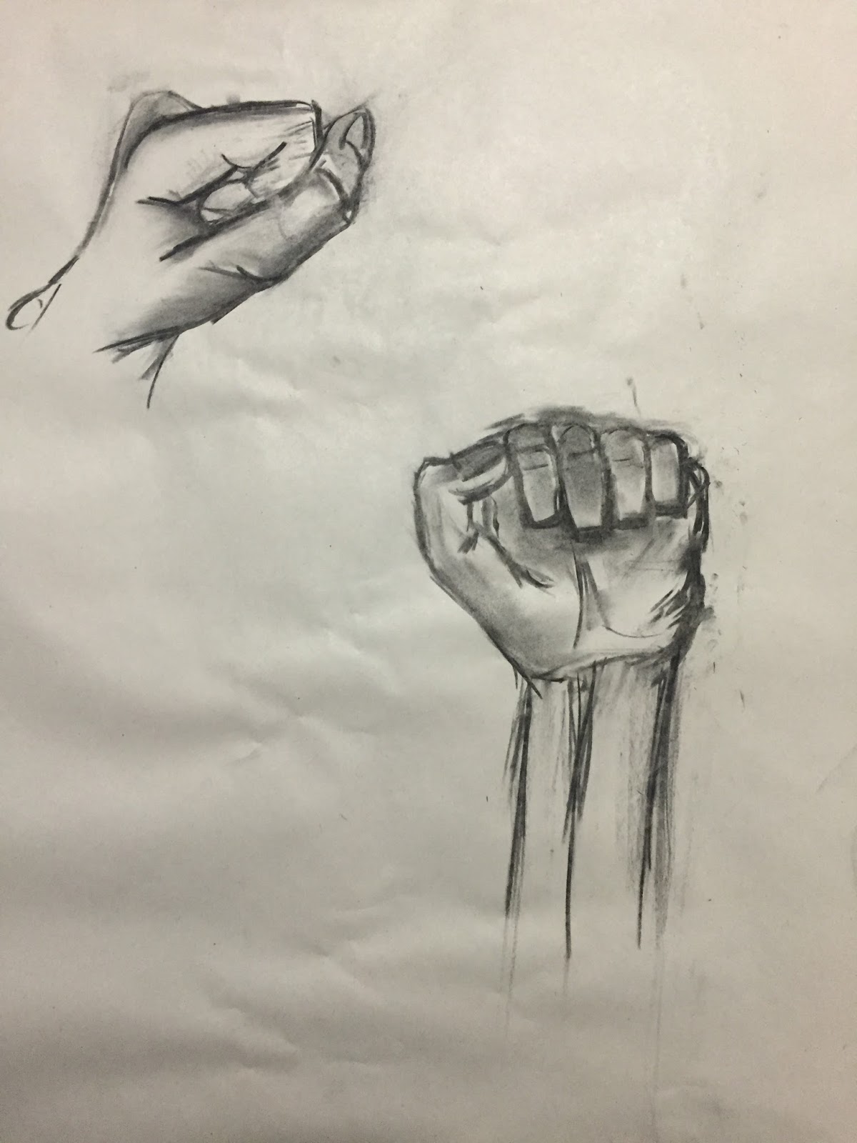
I developed the body of my statue, in which I didn't create the legs because it wouldn't be seen on the design due to the long cloak dropping down over them.I used the head and hands of the previous homework's in my design as a way to cut down on time within the 3D modeling of the character.
The hood first thing I started to work on as for me its easier for me to understand the proportions of the body in which I made first allowing me to fit easily later when I complete the full robes of my statue. Then came the sleeves where I modeled the one and mirrored over to get the same model.


When designing the robes i tried to create it from the model design that i made but it didn't seem to work out the way I wanted the design to go so i had to rethink my process in which decided to recreate the design.
What I had chosen to do was split the design into two section with a lower part and upper which i found to be easier to form and look more natural around the body.
From my original idea I had the robe being more droopy with the cloth, in which I decided on having the characters cloths more fitted.
The Final Model design.
After some complications with the cloak I'm really pleased with the final design even though it has some differences to the original, the statue looks like to me looks really good all it needs is to texture it.
When it was time to UV-Map I started with the clothes then moves to the body as it was much easier than combining everything together, but when I had to unwrap the body it took me a long time to figure out what parts to do first due to the smaller pieces having a bigger impact when stitching together as it went wrong many times.
Once the UV-shots were done I then made my own rock texture but mixing up different textures together my aim was to develop a texture similar to the ones on my battle arena but can stand out more when viewing the environment. I wasn't sure if I should go for a smooth stone texture or more jagged one but I decided fitting the theme of my arena i would got for a curved surface look where I knew the statues place would be.
The next stage was to use an Ambient Conclusion this will produce a nice shadow effect towards the texture to bring the statue out more, in which I did this to all the parts to the model as I wanted it to look its best.
I then placed the UV-Maps into photo as well the Ambient Conclusion and the rock texture then placed everything together, I painted on a brief grey scale paint over the mapping and formed a rocky texture this allowed a small amount of dark textures over the stone to bring out some ash of the volcanic environment.
Here's a what the texturing process in Photoshop for the body.
I then started to rig the statue this allows you to move the statues arms, and whole body into positions of a statue would be, for my case it was only the arms which was easy apart from placing the fingers together which turned out to be hardened than I thought.

When rigging I had to think how would the bones move if in this stance and what positions they would be in. So when rigging I had to move each joint slowly to understand the limits of how far the skeleton would go because if move too far the sleeve in my case would rip so moving individual joints was a slow process but effective non the less.
This is the final design came out like keeping the idea of have the hands locked together. The next stage was to upload the textures and place them on the model.

When texturing you need to create a new lambert this would allow the texture to sit on top the empty one. Here's an example of the layout.

Here is what the final textured design looks like.

I then exported the statue in my Battle Arena where in the end I'm really pleased of the end result I think it looks fantastic and brings out more mystery to the environment.
My Final thoughts over this project has been really enjoyable from the freedom to design everything to the how the design has to link towards the battle arena made the decision on what to do a bit challenging because at first I didn't really know what to do at the start. What I think I could have improved on with my statue is through the design of having much more detailed textures on and could have put it through zbrush to create some cracking in the broken statues.


